Danielle Evans
Graphic Designer and Illustrator

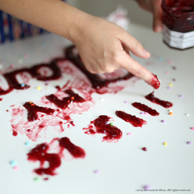
Wonder Jam Process (August 2013): raspberry jam. Husband and wife creative studio, The Wonder Jam, commissioned and shot this jelly-filled piece for promotional pieces.
Primary design concentration:
Lettering
Most preferred tools for designing:
My hands

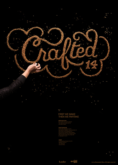
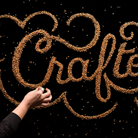
American Advertising Federation (AAF) Cincinnati Addys (November 2013): malt. Crafted for the Cincinnati chapter of the AAF's Addy Awards. Shot by Landor for the show's branding, calling all makers and hand crafters.
How and why did you choose to become a designer?
I had always wanted to pursue something artistic and almost opted for culinary school, ironically. I graduated with an illustration degree but had a healthy dose of design and typographic training in the process. I realized marrying storytelling and design was an effective way to convey thoughts and began looking for a multi-sensory way to draw people in. Food has a universal, friendly appeal everyone can enjoy. Food naturally brings people together. It becomes a cost-effective and ideal material.
Food type is an amalgamation of my various interests. I’ve sculpted, written, illustrated, designed, painted, etc., and was looking for an enjoyable way to meld them together. This nicely encompasses all of them without relying too heavily on one or the other. I’m hoping to escape boredom long-term.
What are some of the challenges you encounter as a designer and how do you deal with them?
Working with different mediums, like paint and chalk, produce different effects and pose unique challenges. The same goes for food—highly pulverized and powdery substances tend to spread impulsively, and more granular items usually pile up heftily. I like to let these features play out a little, while maintaining proper typographic weights and contrasts. The result is imperfect but energetic.
In many cases, I am asked to tackle new foodstuffs or inedible items when presented with a job. This means my process varies from piece to piece; each new substance means starting from scratch. Sometimes I’m fighting with the material for days trying to learn its limitations and exploit its weaknesses. With more familiar goods, the process is expedited significantly. Regardless of material, each piece is lovingly handcrafted.
What is your definition of an “elegant solution,” that is, good design?
Simplicity and embracing imperfection is the most terrifying solution to a project, as too much of either makes a piece juvenile or unskilled. In my cases, however, utilizing either principle gives work distinction and a proper voice. Anyone can overcomplicate, but few can simplify.

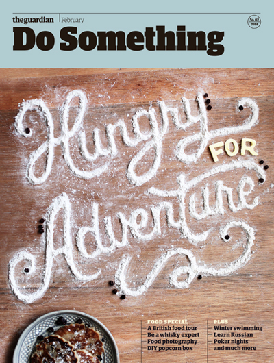
The Guardian’s Do Something (January 2014): flour, butter, and currants. A cover for the lifestyle section of the Saturday Guardian encouraging Londoners to explore the city for the best in traditional food fare. Photography by The Wonder Jam.
From skills to values, what makes a designer successful?
Anyone can learn a skill set with enough patience and time, but honing a creative mindset is a more valuable asset. If a designer is willing to explore and be curious, ideas will open up a person to multiple disciplines throughout her or his lifetime. Conversely, successful work is the blending of skillful technique and creative concept. If a designer knows which is easiest for them, they can always work towards their strongest inclination.
How do you stay motivated and grow personally and professionally as a designer?
I’m motivated in part by economics, strategy, praise, and pride. While not a very glamorous answer, it’s very true of me. I love problem-solving, and doing so for wide audiences, and great pay further instills a sense of pride in this weird niche I’ve made for myself. I think, at heart, I’m first an artist, secondarily an entrepreneur.
For those aspiring to become a designer, whatever the discipline, what is your advice?
I am very attracted to design that is graphic, colorful, shape-based and clean. Nothing about that statement describes my current portfolio, but for years, I doggedly tried to make work I admired rather than work I naturally created. I cannot draw a straight line, nor am I detail-oriented or interested in pixel-perfection, which rendered these solutions half-finished and juvenile. It was not until I needed a break from the insane tweaking that I allowed myself to make a series of mistakes, which became my style.
Pursue the style that embraces your strengths to make the most of your creative endeavors. A style emerges when a creative designer habitually produces a wonky ‘g’ loop or a sloppy ‘S.’ Student work tends to look very similar because most are afraid to fail and, in turn, confine themselves to grids and Helvetica. Explore with confidence!
What is your quest in design, from a professional practice, education or evolution standpoint?
In the basest form, to avoid boredom—isn’t that awful? In a more noble vein, to impart truth and authenticity to others.
Previous: Amanda Buck | Next: Aileen Cheng

Support this solo initiative
What began as a collection of links has evolved into a comprehensive archive committed to creative culture—offering so far 395 interviews with under-the-radar Artists, Designers & Makers, in addition to 202 write-ups across events, books, movies, more. Free to explore. Free from ads. If you gain a level of motivation, knowledge, even delight, from Design Feast, please support on Patreon or chip in via Buy Me a Coffee. Thanks for your consideration!
Wishing you continual success,
Nate Burgos, Content Creator & Publisher
Comments
There are no comments yet.
Leave Your Comment