Tonya Douraghy
Graphic Designer, Art Director
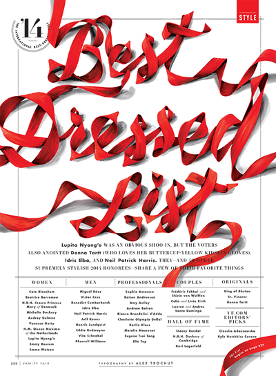
Art direction and design for Vanity Fair. Typography by Alex Trochut.
Primary design concentration:
Visual Communication
Most preferred tools for designing:
Curiosity
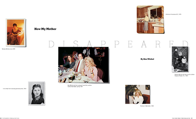
Editorial design for The New York Times Magazine.
How and why did you choose to become a designer?
I wanted to be a journalist, but didn’t like it in practice as much as in theory. So I went through a list of every major at my university, and design seemed like a practical way to make it through the next four years. And I was able to study textile and graphic design in tandem, which was hugely appealing.
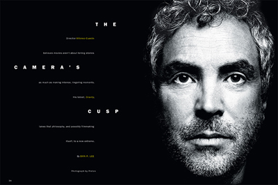
Editorial design for New York Magazine. Photograph by Platon.
What are some of the challenges you encounter as a designer and how do you deal with them?
It really all comes down to communication. You can have the best idea in the world, but if you can’t convince your editor or your client, or work well with your illustrators, then it’s not worth much.
What is your definition of an “elegant solution,” that is, good design?
If people want to engage with it, that’s one indicator of design done well. And I generally find that the most effective solution involves simplicity.
From skills to values, what makes a designer successful?
Every designer is going to have a different interpretation of success. I think “do no harm” is a good place to start in terms of values. Beyond that, doing something you love every day feels like success to me.
How do you stay motivated and grow personally and professionally as a designer?
Appreciating the surprises that come up when I’m designing. Taking breaks. Forcing myself out of my comfort zone. And I find the intensity and tight deadlines at magazines to be very motivating.
For those aspiring to become a designer, whatever the discipline, what is your advice?
Always work with people who are better than you currently are.
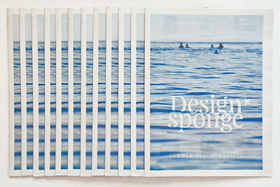
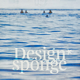
Art direction and design for the Design*Sponge summer newspaper.
What is your quest in design, from a professional practice, education or evolution standpoint?
To never be bored. To not repeat past work, and to keep moving forward.
Previous: Heather Noddings | Next: Chelsea Lee
Support this solo initiative
What began as a collection of links has evolved into a comprehensive archive committed to creative culture—offering so far 395 interviews with under-the-radar Artists, Designers & Makers, in addition to 202 write-ups across events, books, movies, more. Free to explore. Free from ads. If you gain a level of motivation, knowledge, even delight, from Design Feast, please support on Patreon or chip in via Buy Me a Coffee. Thanks for your consideration!
Wishing you continual success,
Nate Burgos, Content Creator & Publisher
Comments
There are no comments yet.
Leave Your Comment